Intuitive mobile app for blood donors
UX/UI Design | Design System
About the project
The goal of the project was to create an intuitive and engaging mobile app for blood donors that met the client's specific requirements: native to iOS, optimised for the iPhone 13 Pro Max, limited to a single view, yet clear and motivating for regular blood donations.
I began by analysing competing apps such as Blood Donor, Close Relatives and Blood Donor American Red Cross, identifying best practice and areas for improvement. Based on this, I designed an initial paper prototype, which I then subjected to guerrilla testing. The results indicated a need to improve the layout of the information tiles and simplify the function of adding another blood donation.
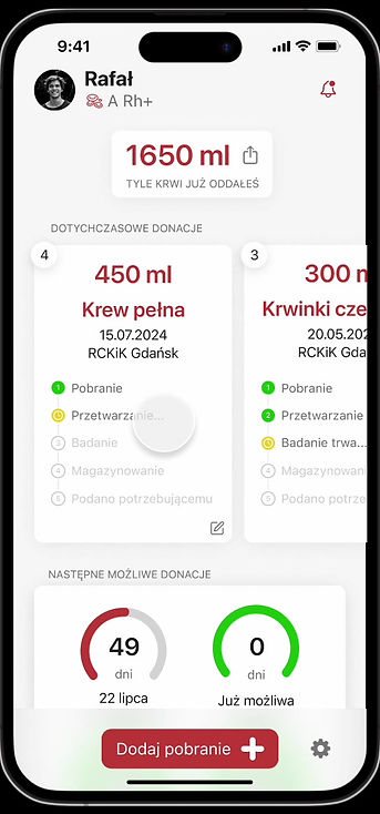
Figma's final UI Design incorporated all the findings from the testing, providing an aesthetically pleasing and functional interface in line with Apple's guidelines. The final design not only meets the client's requirements, but also offers users clear data on blood donations, increasing their commitment to regular donations.
Used tools
Desk research, Competitor analysis and UX analysis, Paper prototyping, Guerrilla testing, Hi-fidelity UI Design
Desk research
To begin, I conducted a detailed analysis of the design requirements for iOS 18 apps, with a focus on the iPhone 13 Pro Max. I delved into the iOS GUI guidelines, the Human Interface Guidelines and the rules for creating icons in the Apple ecosystem.
I then researched the available apps for blood donors, both Polish and foreign. I tested, among others, Blood Donor, Bliscy Krewni, RCKIK Wrocław, as well as Blood Donor American Red Cross, BloodLine and Legion HDK. The analysis showed that although most of the apps offered similar functionality, none of them met all the client's requirements. This created space for an app that would respond to user needs in a more comprehensive way.


Competitor and UX analysis
During the competitive analysis, I focused on a detailed evaluation of the app's functionality. Among other things, I analysed access to information on the number of donations, types of donation, the nearest possible donation dates and the total amount of blood donated by the user. Most of the apps performed these tasks similarly, but the Blood Donor American Red Cross app stood out, being the only one to detail the process that donated blood goes through. In contrast, the Blissful Relatives app stood out for its user-friendly interface, both aesthetically and functionally. The findings from this analysis helped me to develop unique solutions for my app.
Paper prototype

Based on previous research, I created initial sketches of the application that allowed me to quickly visualise the key features of the interface. This allowed me not only to test the layout of the functions, but also to prepare for quick user tests.
Guerrilla testing
In the next step, I conducted guerrilla tests with a paper prototype. Through direct user feedback, I found out that the interface with large information tiles was intuitive, but that some sections were too dense. A suggestion was made to enlarge these elements. Users highlighted that the app was easy to use, which was very positively evaluated. However, the difficulty in finding the option to add another blood donation required me to improve this functionality. Based on these comments, I improved the app's readability and intuitiveness, and at the same time started working on the UI design in Figma.
Hi-Fidelity UI Design
The final stage was to create the final interface design (Hi-fidelity UI Design) in Figma, taking into account all the client's guidelines and the findings from user testing. I also developed the application's icon in three versions: regular, dark and tinted. I present the results of the work below, in the form of screenshots and a video.